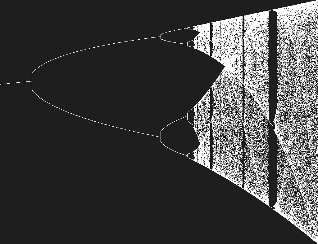
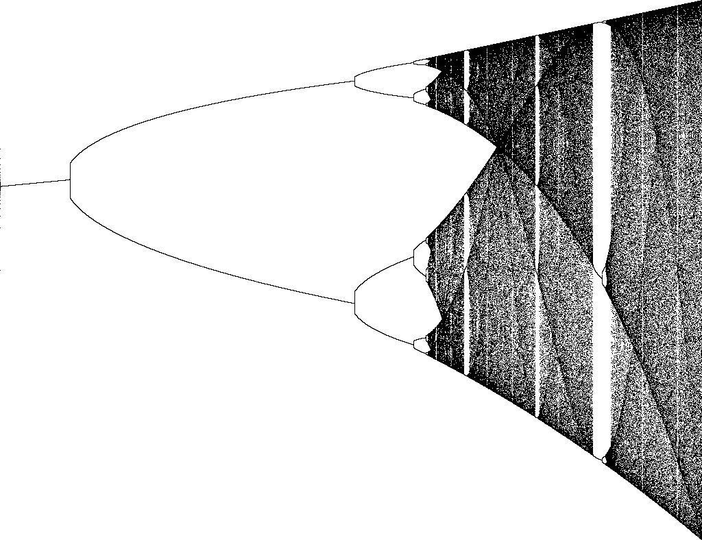
Bifurcation Diagram
2020
Lately, I did a small, funny project. The goal was to visualize a bifurcation. The bifurcation I was going to plot is one of the most famous ones: Its the bifurcation for the logistic map: . But before I’m going to talk about the program, I want to exemplify some of the mathematical backgrounds, without diving too deep into dynamic systems and chaos.
First of all, bifurcation is a period-doubling, which occurs while changing the control parameter. In my case, the control parameter is , and the bifurcation happens, like in many others, in a fixed ratio: the Feigbaum Constant. As you increase r by a tiny amount up to 4 you are going to see that at , the graph splits into two. At , the graph forks into a period of . And so on until , then the deterministic chaos starts.
For this question, we have to look at the function, which represents the logistic map from another angle. We can use the equation for calculation populations.
Here we have the function again: . is the current population, but it doesn’t represent it in absolute value, rather in a relative amount to the theoretical maximum. For example, we let be this year’s rabbit population of . The theoretical highest population possible is , due to nature factors like remaining space or whatever you can imagine. Now I want to calculate the population for next year.
For that, I have to know . In the case of population calculation, is considered as the growth rate. If we would only use the parameter , this would be a linear system. For , the population decreases over time and goes extinct at some point. For , the population increases infinitely. In nature, this isn’t the case. Every year rabbits die, du enemies or old age. The term represents this exact reduction. It also transforms this equation into a dynamic system. You also might notice that if the theoretical maximum of gets reached, the population will go extinct next year.
Let’s take a population of with a growth rate of . If we put these values into the equation wwe will have a population of in the next year. A year later and if you iterate over, and over, you will see, that the population stays at about , that means, the equilibrium population is . That’s the case for , not every time, but the equilibrium population will settle down at one value.
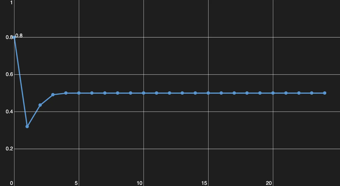
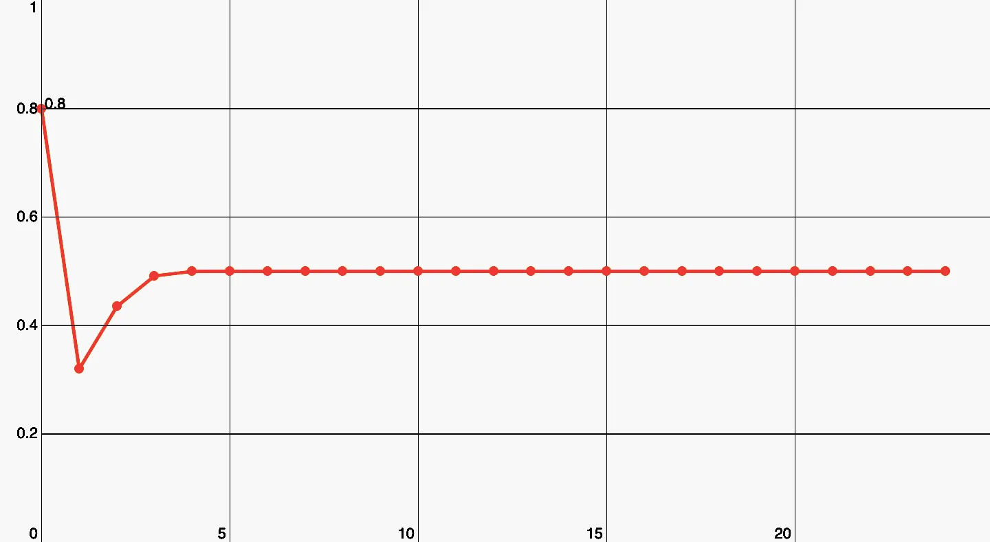
Here you can see, how the population evolves, for this exact parameter (r = 2).
At , the first period-doubling happens. Now the equilibrium population alternates between two values back and forth.
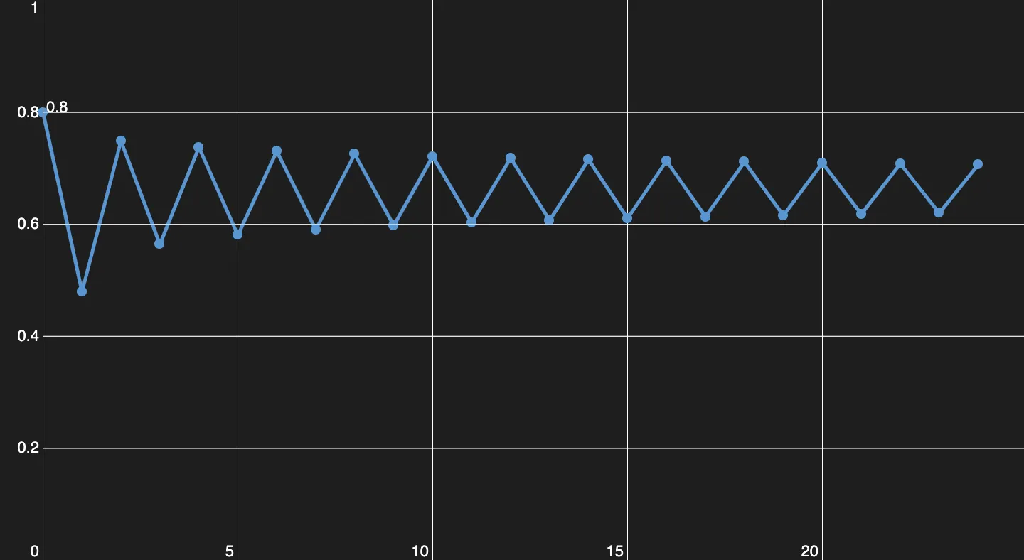
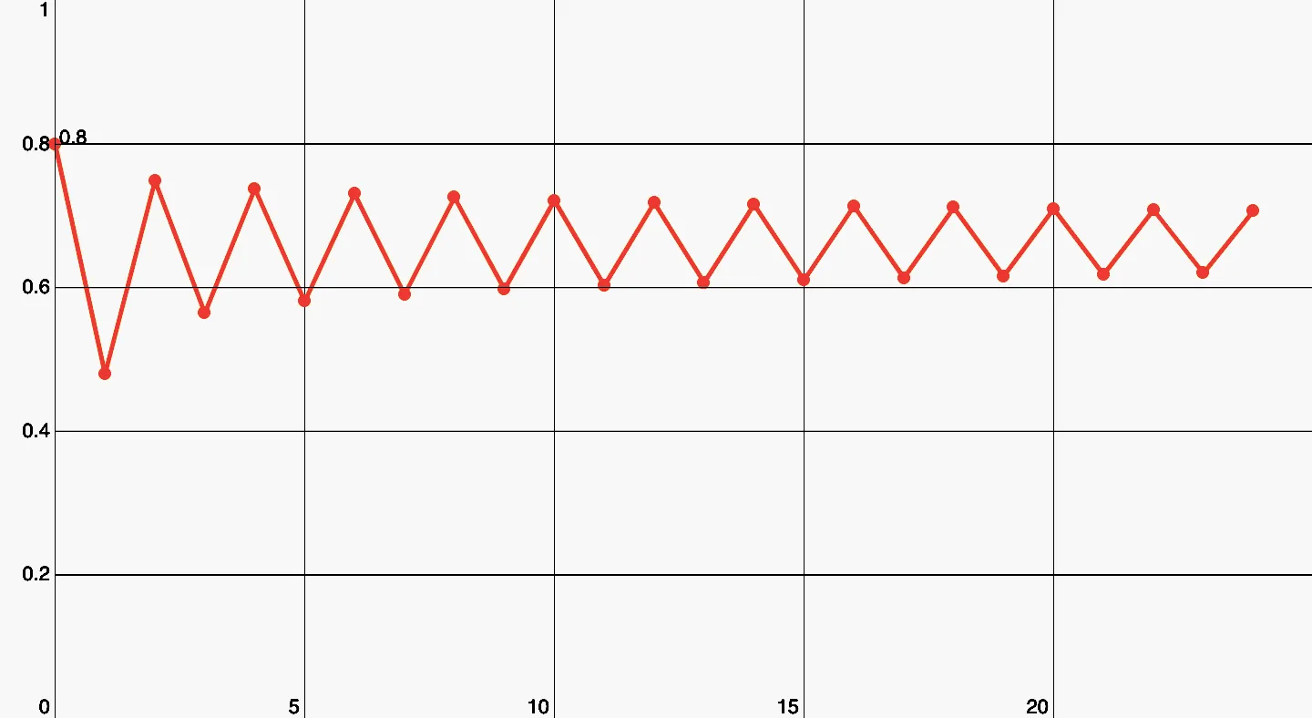
Here we have a period of 2.
With , you are going to have a period of , the equilibrium population alternates between four values.
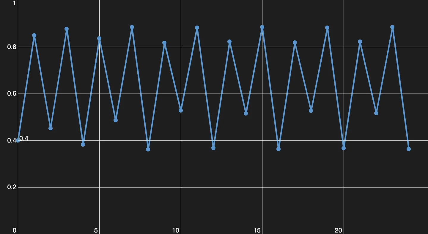
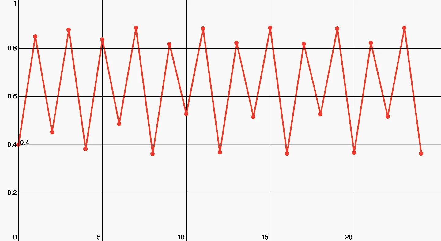
The next step is a period of 4.
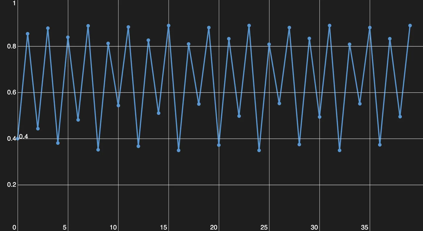
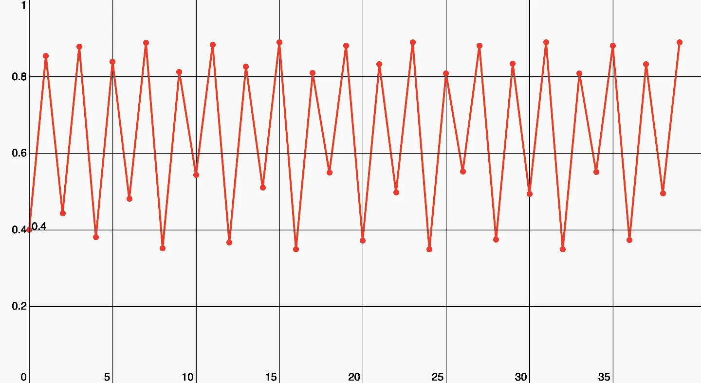
A period of 8. It's crazy how a simple function like this can create patterns like these.
And for the grand final after , you have chaos.
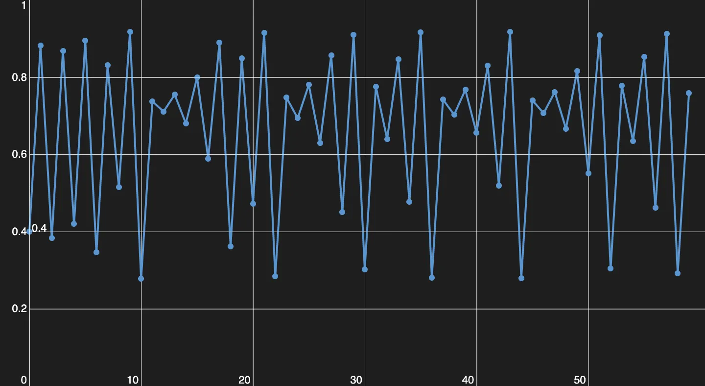
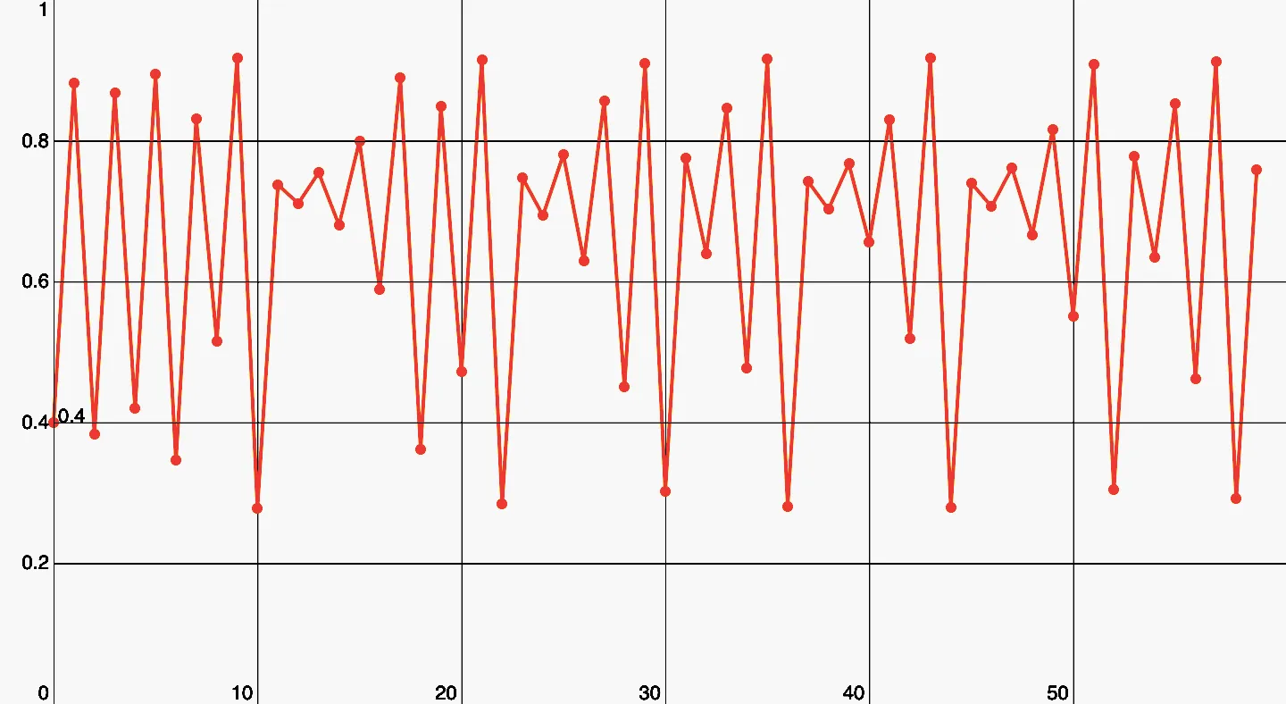
Chaos! It's almost sad that nothing of this is random, just pure math.
Deterministic chaos, to be exact. Here you can find every period. Every you pick, is part of some period, whether one of or or etc. It’s deterministic because theoretically, you can calculate the start value for every you pick on the graph and predict the next . Practically it isn’t possible because you would need to an infinite amount of decimal points.
Enough theory lets go on to the program! I wouldn’t make a post about it if the only thing the program does is plotting this perspective of the diagram, so let’s have a look at some features. I’ll be going to start with the basics, the only way for controlling the diagram/perspective is through the console of your browser. You can call a javascript function, to send instructions to the program.
Disclaimer: You need to be able to access the Console, to control the program.
The functions help() and zoomHelp() are going to give you a rough idea of the purposes of the functions, but here I’m going to explain it a little bit further.When you open up the script, the program memorizes the size of the browser window, because the size is needed for the calculation.The program doesn’t keep track of the size of your browser, so you have to reload the page or call resize() when you did resize your window. If you want to clear the screen, you have to call clearScreen().
I have preprogrammed some functions into the source code so that you can have a look at some beautiful sections of the diagram without having to worry about plotting-parameters. These are plot() and plotPointx().
With plot(), you can have a look at the whole diagram. It shows you everything from to . The start is only at because that’s where the real magic happens. Before you will only find a boring, ugly line.
With plotPointx() you have the options: plotPoint2(), plotPoint1(), plotPoint02(), plotPoint005(), plotPoint0001(), plotPoint00005(). The Numeric values represent fractions of . For example, by plotPoint02(), you are going to have a value at the left side of your screen and on the right side. For graphing, I have to iterate over the equation. How often I have to iterate tells me the variable iterations. Its default is , but it can be changed with the setIterations(to). The argument to is going to be the new value for the iterations variable. The iterations are responsible for the density of the points. If you set it too high, it might take too long. If it’s too low, then you aren’t going to see too much.
With the plotRange() function, you can plot your very own section of the diagram. Therefore you have to pass at least 4 arguments.
The first argument is called from here you have to give a value of between and . This value is going to be on the left side of your screen. The second one is to, this closes the range of . This value is going to be the upper bound of iteration, you are going to see it on the right side of your screen, and it also shouldn’t be smaller than from.
The next two arguments are minX and maxX. These aren’t restricting x into a certain range, but they going to change the appearance of the diagram. For example, if you set the minX to and the maxX to , you aren’t going to see points for and , but these points gets drawn although. Setting these arguments to anything else than and prevents the diagram from stretching in particular by very small ranges of .
The fifth parameter (iterations) is optional, and the sixth parameter (zoom) is only needed from the algorithm.
If you want to know the current configuration of the diagram, you can call logPlot().
As you might recognized, there is also an ability for zooming. For activating the zoom mode, you have to call zoomIn() for zooming in or zoomOut() for zooming out. If you want to disable the zoom mode, you have to call disableZoom(). Zooming creates a pretty heavy workload because of that, the iterations for zooming are less (default: ). You can change them like you want with the setZoomIterations(to) function. Just pass the number of iterations as an argument. You can also change the zoom rate/factor with the setZoomRate(to) function, again pass the new factor as an argument. The zoom factor/rate is the multiplier for zooming, which means a zoom factor of 2 will scale the diagram by x2.
If you have one of the zoom Modes activated (booth work the same), you can zoom by clicking in the diagram. The location you clicked is going to be in the center after zooming. Because the control parameter is very sensitive and has to in the range of , some weird stuff or nothing will happen if you leave this range. To prevent this, I recommend not zooming out from the normal stage (achieved with plot()) or “walk-around” with a zoom rate of 1 in rough stages of the diagram (a change of from left to right bigger than ).
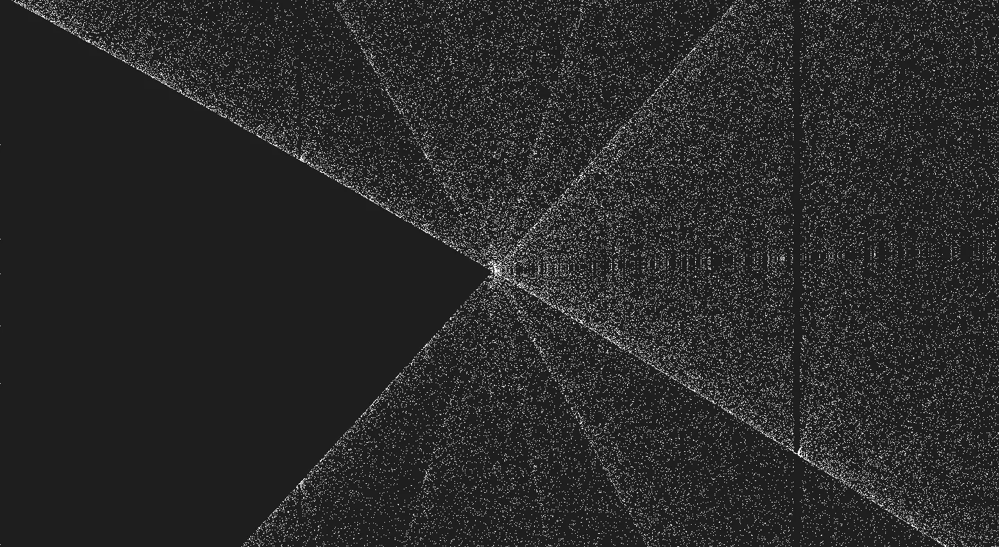
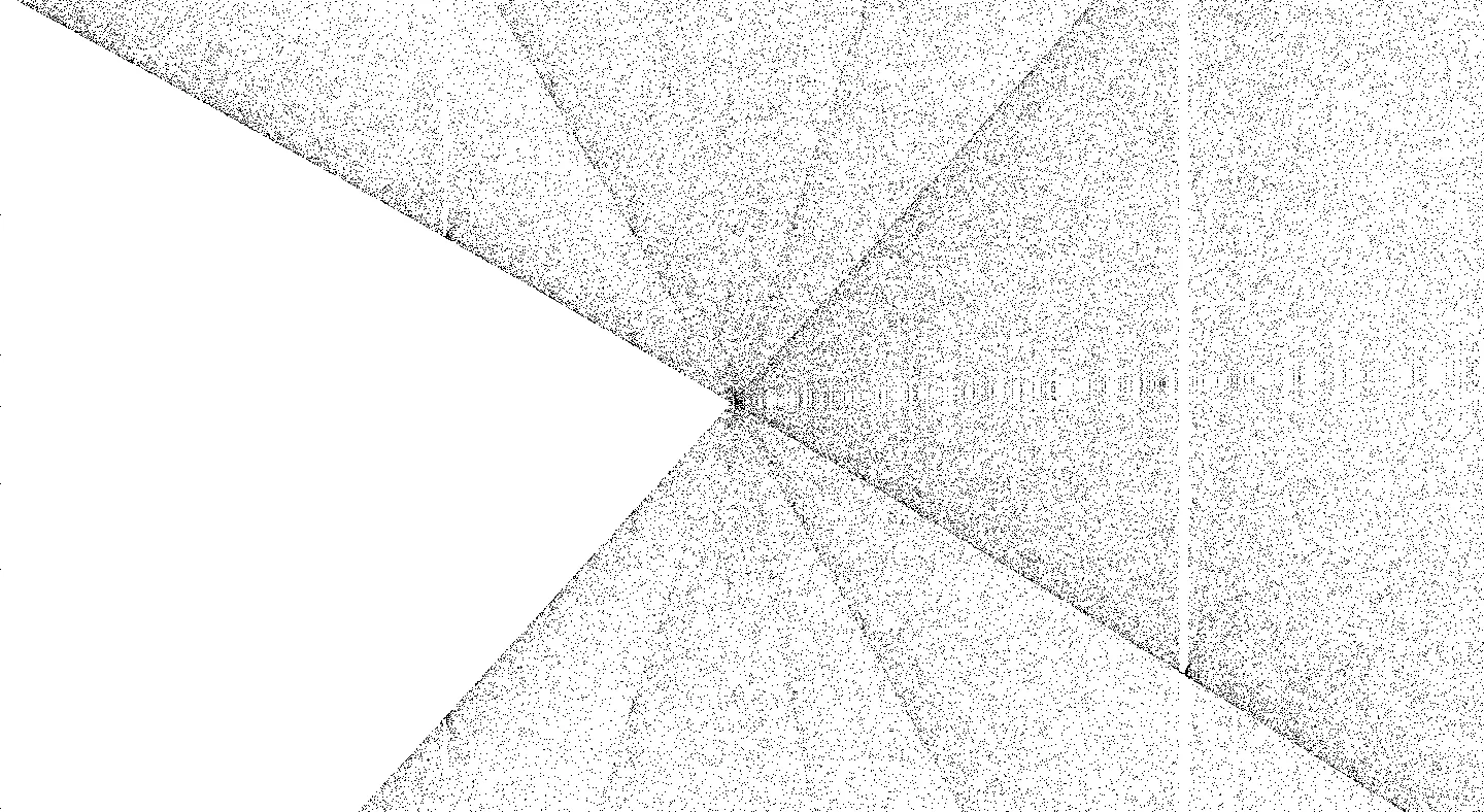
Here I have an example of what you can achieve with zooming.
That’s all of the functions. I hope you did understand my instruction for the program. The source code of the project is also on Github.